Happy Hump Day, everyone! 🐫 Today, we're going to cover some work we did just a couple weeks ago that focused mostly on the rate calendar.
We're into September updates now, so we'll switch back to the normal weekly format. A quick mention though - in case you missed it, be sure to take a look at the Midsummer Updates series we've been posting over the past couple weeks. That series covered all the products updates that were released back in July and August. There were 9 parts, beginning with this one, and it's worth the time to read about the dozens of updates that were put out during that two month stretch.
New Features
Our rate system has undergone a number of major changes over the years. In fact, check out the original rates announcement from more than 10 years ago! A week later, we talked about recurring and specific-date seasons for the first time, though they were actually called "rate overrides" at the time. Wow, those posts make me feel old.
Over the following years, we changed that to a list system where seasons and seasonal rates could be created, and then about 18 months ago we dumped that and moved to a matrix-style seasonal rate editor which is vastly easier to work with and prevents a lot of common missteps.
Along the way, we introduced spot rates so that users could simply "paint over" the seasonal rates with anything they wanted on an ad hoc basis as well as use dynamic pricing engines that do the same. This led to a central Rate Calendar in the Settings area that became the home for where you go to see and change rates. Even if you use seasonal rates to price periods of the year at a time, you probably still look at the Rate Calendar to get a sense of how your weeks and months look with unavailable dates mixed in. This allows you to instantly select some gaps in between and price those days with spot rates so that you can quickly increase or decrease the rate and minimum night rule to attract a larger market. If no spot rates are set, the seasonal rates show through. If no spot rules are set, the seasonal (or property) level rules show through.
As we've watched how users have used the Rate Calendar, we made a list of changes we thought would improve the experience, and we're happy to announce that those changes are now out live! The Rate Calendar has been significantly overhauled in color, formatting and information.
To see the changes, go straight there: Settings > Rates.
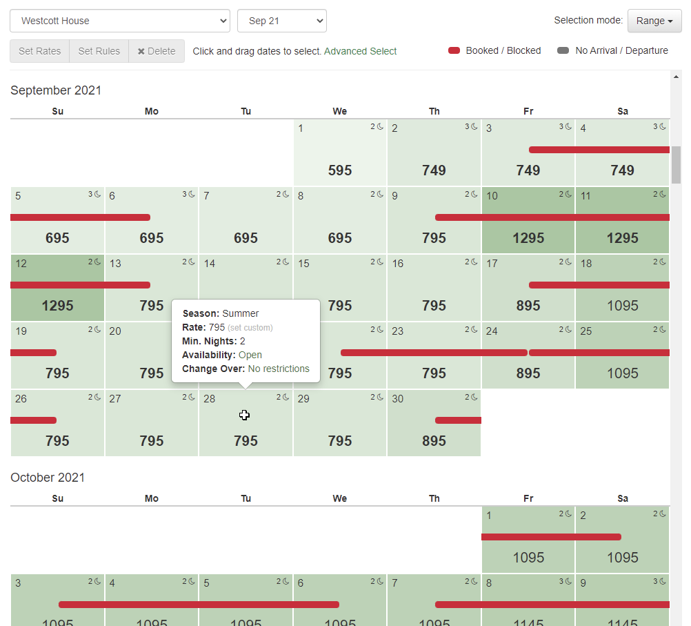
The above screenshot shows a number of the improvements that were made, but there's more there than you may realize, so I'll break it down in detail...
Less-Obtrusive Booking/Block Indicator
Previously, if a day on the Rate Calendar was booked or blocked, we colored the entire day, so there was no room for any other shading, coloring or information in the background. As we started designing other things we wanted to do, we realized that the booking/block indicator needed to be far less obtrusive.
Now, when a day is booked or blocked, you'll see a slim red ribbon inserted through the middle of the day, denoting that the period is taken, but it won't impact the information and formatting for that day or the days around it.
To be clear, this red ribbon only appears for true bookings or blocks, not other virtual blocks like gap rules or change-over restrictions. So a guest trying to book your property on your website or on a channel like Vrbo might see that a day is unavailable because there's a forced gap next to a different booking. That would not appear on this Rate Calendar as a red ribbon. However...
Virtual Blocks for Gap Rules and Change-Over Indicators
Changing the booking/block indicator made us think - why not add virtual blocks as well?! So we did!
As the owner or PM, any time you're looking at your calendar, you really want to see other restrictions in addition to true bookings or blocks, but you also want to be able to distinguish whether it's someone actually staying there or a different distinction. With that in mind, we decided to add another block indicator for rule restrictions like gap rules or change-over restrictions and use a gray color to distinguish it from true blocks and bookings. Here's an example of a booking after I turned on a forced gap rule of "1 night between bookings".
These virtual blocks will show for any rule where the day is not able to be booked because of your property settings. The most common example of these is:
- Arrival or Departure Restriction - occurs when you have a day of the week set so that guests cannot arrive, depart or both.
- Gap Restrictions - occurs when you are forcing a certain number of days between bookings. You might not allow back to back bookings because it's too hard on your cleaners to prepare the property between bookings.
Hover Cards
No matter how well we design the Rate Calendar, there's still information you just can't know by looking at it, but you need that information to tell a bigger story. We added hover cards to each day cell, so that as you move the mouse over each day, the full details of that day are clear. You don't have to click on the day; a simple hover will do the trick.
The hover card, shown above, gives you 5 categories of information:
- Season - the primary season that the day falls into. If multiple seasons exist, it will show the primary one that OwnerRez is using given our season selection rules (specific date over recurring, priority status, etc)
- Rate - the rate amount for that day and where it comes from (seasonal or a custom spot rate)
- Minimum Nights - the required number of nights for that day and where it comes from (seasonal or custom spot rate). If no reason is given, then it's the default rule for the current property.
- Availability - whether the property can be booked or blocked and a warning about guests arriving/departing.
- Change-Over - whether the property can have arrival or departure and why. Gap rules and arrival/departure restrictions, set on the season or property, are the most common reasons.
The hover card works on mobile devices too even if a mouse isn't present. To see it, long-press on the day cell and the hover card will appear.
Intuitive Day Cell Layout
One of the very first things we changed, in this overhaul of the Rate Calendar, was the text layout on each day cell. The old design was confusing when it came to what the rate was, how many nights were required and even what the day of the month indicator was. We studied some general calendar systems and decided that the day of the month number should be in the top left corner, the rate should be centered in the middle and much larger in font size and the night rule should be top right with an icon denoting nights. Here's how the day layout looks now:
When looking at the small numbers at the top of the day cell, your eyes instantly understand which one is the night rule because of the little moon icon, and the large centered rate amount at the bottom is pretty obvious as well.
The rate amount will be bold if it's a spot rate instead of the seasonal rate bubbling up.
The same bold format is applied to the minimum nights rule if the minimum night rule is custom set as a spot rate.
Heat Map Shading
Since we're talking about formatting, let's talk about all that green color.... Each day has a different shade of green based on where the rate falls relative to the property's pricing overall. This gives you a heat map feeling as you look at the calendar and causes your eyes to instantly pick up where there are high or low-priced days. Darker shades of green are higher-priced days and lighter shades of green are cheaper-priced days.
As you select and change rates, the coloring will instantly change as you do your work to reflect a new heat map of colors. If you set higher rates on certain days, the lower-priced days around those days will instantly change shades and vice-versa.
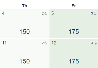
The heat map coloring works no matter if your rates are spot rates or seasonal. Notice in the previous screenshot how the Monday days show a non-bold price, which means that those days have a seasonal rate (ie. no spot rate was set), yet the green shading is calculated on that as well. Because the seasonal rate is $150 on those days, Monday is the cheapest day and gets the lightest shade of green.
If you're wondering why your Rate Calendar has an even shade of green across the months you are looking at, it's because your high and low amounts are probably more rare or occur outside the time period you're looking at. Or, your high and low price really aren't the true high and low. For instance, if you have some nights of the year without a rate (ie. the rate is $0 because you never set it) then the lowest rate is really 0, and those 0-night rates will have the true lowest shade of green. Here's an example using the same dates and rates in September as the previous screenshot.
Notice that the days in September are priced exactly the same as the previous screenshot but the green is much more plain and even across the month of September. Why? Notice the month of August above it and the month of October below. August has higher rates and October is way down at 0 where a couple of nights weren't priced at all. Because of this, the heat map is skewed in coloring because the true high and low rates are outside of September, so what you see in September is medium even though the rates do vary inside the month.
Separate Rate and Rule Action Buttons
We noticed some confusion on how rates and rules were set in the past, and we wanted to add additional ways to set rates, so we separated Rates and Rules into separate action buttons.
Now, after you select the days you want to change, you'll see both "Set Rates" and "Set Rules" light up as possible (but separate) actions you can click on.
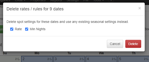
The Clear button was changed to "Delete" to remove any confusion about whether that button clears the set rate amount or clears selection. You now have a "Clear Selection" link to the side of that which will clear your selection, and the new "Delete" button will open a window asking if you want to remove rates, minimum night rules or both.
Setting rates and rules each opens their own windows where you can do that independent of the other. There is no need to set a custom rate and rule for the same night unless you want to. If the minimum night rule isn't set, the season or property rules will be used as always.
Set Rates by Relative Amounts
Another upgrade we made is in how you set the rate amount itself. After we split the "Set Rate" action to its own button and window, we had plenty of room for more rate options, so added the ability to increase or decrease the rate by relative amounts.
To see why this matters, imagine wanting to select 6 months of week days (ie. no weekend days) and decrease those nights by 20% across the board. How would you do that? In the past, you could select those nights, using the Advanced Select function, but then you'd have to set the amount by putting in a single fixed amount. That one amount would then be applied to the entire 6 month selection. We wanted to add the ability to increase or decrease rates by an amount relative to whatever the current rate was across the selected period, so the Set Rates window now has those options.
Here are the Set Rate options that are now available:
- Set nights to exact amount - this is the same as what we used to offer before. Every night in your selection will be overwritten to the exact amount you enter.
- Increase nights by percentage - this is a 0-100% selector that will bump up the current rate of each night, relative to whatever that night's rate is, by the percent you select.
- Decrease nights by percentage - same as above, but each night will decrease instead of increase.
- Increase nights by amount - this is a flat amount that you can enter which will bump up the current rate of each night, relative whatever that night's rate is, by the flat amount you enter.
- Decrease nights by amount - same as above, but each night will decrease instead of increase.
This gives you a ton of flexibility in still adjusting lots of days but maintaining what was there without painting over it too harshly.
Okay, that pretty much wraps up the new work done on the Rate Calendar, and we hope it makes a big difference in your ability to find, set and manage your rates in OwnerRez! In the near future, we plan to add arrival and departure restrictions as rules on spot rates, so that you can set those restrictions directly without going through season or property rules. We also plan to add maximum night rules to spot rates and show where dynamic pricing engines (like PriceLabs or Beyond) are setting nightly rates by showing that on the hover card.
Bug Fixes
You can use angle brackets if you really want to... If you have HTML like content in your property names (which basically means bold, underline, colors and other types of rich-text formatting), you might have hit an error on the Settings > Check-In / Check-Out page. All better now!


